The attached note revisits five charts I find to be very useful in understanding investing. The key points are as follows:
- Successful investing should be simple but increasing rules, regulations, choices and social media are making it anything but. At its core, it is still simple though.
- These five great charts focus on critical aspects of investing: the power of compound interest; the investment cycle; the roller coaster of investor emotion; the wall of worry; and time is on your side when investing.
- They are particularly pertinent in volatile and seemingly uncertain times like the present, so they are well worth a revisit.
Introduction
Investing seems to be getting more and more complex. Ever increasing complexity in terms of investment products and choices, regulations and rules around investing, the role of social media in amplifying the noise around investment markets and the increasing ways available to access various investments are all adding to this complexity. However, at its core, the basic principles of successful investing are simple. And one way to demonstrate that is in charts or pictures. This note revisits five charts I find useful in understanding investing. They are particularly pertinent in volatile and seemingly uncertain times like the present, so they are worth a revisit.
Chart #1 The power of compound interest
My love of this chart came out of my good friend and well-known economist, Dr Don Stammer, regularly espousing the importance of the magic of compound interest. And it is like magic – but many miss out because they are too busy looking for disasters around the corner or assuming that once disaster hits it will be with us indefinitely! What it shows is the value of $1 invested in various Australian assets in 1900 allowing for the reinvestment of dividends and interest along the way.
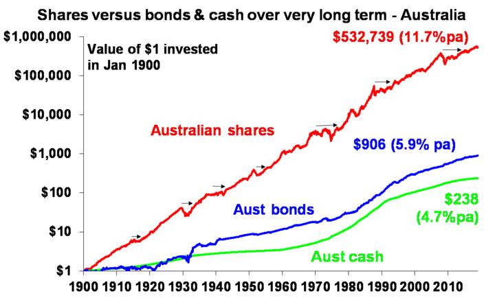
Source: Global Financial Data, AMP Capital
That $1 would have grown to $238 if invested in cash, to $906 if invested in bonds and to $532,739 if invested in shares. While the average return since 1900 is only double that in shares relative to bonds, the huge difference between the two at the end owes to the impact of compounding or earning returns on top of returns. So any interest or return earned in one period is added to the original investment so that it all earns a return in the next period. And so on. I only have Australian residential property data back to 1926 but out of interest it shows (on average!) similar long term compounded returns to shares.
Blowed if I know where it came from, but the “Law of 72” is useful way to understand how long it takes an investment to double in value using compounding. Just divide 72 by the rate of return and that’s the answer (roughly). For example, if the rate of return is 2% per annum (eg, the interest rate on a bank term deposit), it will take 36 years to double in value (= 72 divided by 2). But if it’s, say, 8% pa (eg, what shares may be expected to return over the medium-term including dividends), then it will take just 9 years (= 72 divided by 8).
Key message: to grow our wealth, we must have broad exposure to growth assets like shares and property. This is far more important than second order issues like which particular stocks to have in your share portfolio. While shares have been volatile lately and the short-term outlook for Australian housing is messy, both will likely do well over the long term.
Chart #2 The investment cycle lives on
The trouble is that shares can have lots of setbacks along the way as is particularly evident during the periods highlighted by the arrows on the share market line. The higher returns shares produce over time relative to cash and bonds is compensation for the periodic setbacks that they have. But understanding those periodic setbacks – that there will always be a cycle – is important in being able to not miss out on the higher returns that shares and other growth assets provide over time. The next chart shows a stylised version of the investment cycle.
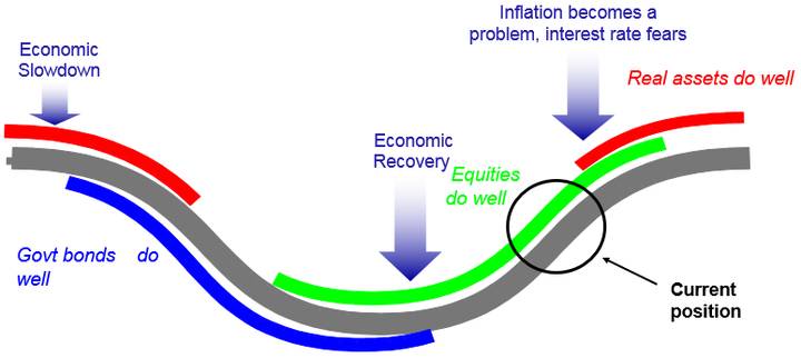
Source: AMP Capital
The grey line shows the economic cycle from “boom” to “bust” to “boom” again. Just before the low point in the economic cycle, shares invariably find a bottom and start to move higher thanks to attractive valuations and easy monetary policy and as smart investors anticipate an eventual economic recovery. This phase usually sees scepticism and disbelief as economic conditions are still weak. Shares are eventually supported by stronger earnings as economic conditions improve, which eventually gives way to a blow off phase or euphoria as investors pile in. This ultimately comes to an end as rising inflation flowing from strong economic growth results in ever tighter monetary policy, which combines with smart investors anticipating an economic downturn and results in shares falling. Often around the top of the cycle real assets – like property and infrastructure – are a better bet than shares as they benefit from strong real economic conditions. But that’s not always the case. Once the downturn starts, bonds are the place to be as slowing growth gives way to falling inflation which sees bond yields fall producing capital gains for investors. At some point, of course, easing monetary conditions and attractive valuations see shares bottom out and the whole cycle repeats.
Key message: cycles are a fact of life and it’s usually the case that the share market leads the economic cycle (bottoming before economic recovery is clear and topping before economic downturn hits) and that different assets do best at different phases in the cycle. Of course, each cycle is a bit different. Some are short but some, like the big bull market in US shares since 2009, are long because the recovery is slow and so it takes longer to build up excesses that end the cycle.
Chart #3 The roller coaster of investor emotion
Its well known that the swings in investment markets are more than can be justified by moves in investment fundamentals alone – like profits, dividends, rents and interest rates. This is because investor emotion plays a huge part. The next chart shows the roller coaster that investor emotion traces through the course of an investment cycle. A bull market runs through optimism, excitement, thrill and ultimately euphoria by which point the asset class is over loved and overvalued and everyone who is going to buy has – and it becomes vulnerable to bad news. This is the point of maximum risk. Once the cycle turns down in a bear market, euphoria gives way to anxiety, denial, capitulation and ultimately depression at which point the asset class is under loved and undervalued and everyone who is going to sell has – and it becomes vulnerable to good (or less bad) news. This is the point of maximum opportunity. Once the cycle turns up again, depression gives way to hope and optimism before eventually seeing euphoria again.
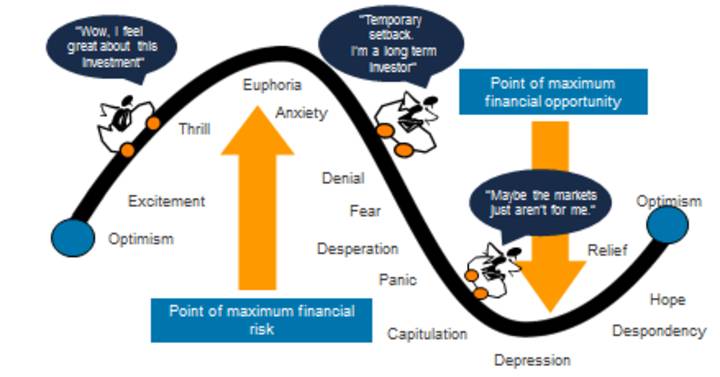
Key message: investor emotion plays a huge role in exaggerating the investment cycle. The key for investors is not to get sucked into this emotional roller coaster: avoid assets where the crowd is euphoric and convinced it’s a sure thing and favour assets where the crowd is depressed and the asset is under loved. Of course, doing this is easier said than done which is why many, if not most, investors end up getting wrong footed by the investment cycle. Getting sucked in during the good times only to panic out during the bad times.
Chart #4 The wall of worry
There is always something for investors to worry about. The worries ramped up last year with concern around inflation, the Fed, rising bond yields, trade wars, US politics and President Trump generally, Italy, the ongoing Brexit soap opera, Chinese debt and slowing growth, the surging and then plunging oil price and in Australia with the Royal Commission and falling home prices. And in a world where social media is competing intensely with old media and itself for attention on the nearest screen right in front of you it all seems more magnified and worrying than ever. But of course most of this stuff is just noise. The global economy has had plenty of worries over the last century, but it got over them with Australian shares returning 11.7% per annum since 1900, with a broad rising trend in the All Ords price index as can be seen in the next chart, and US shares returning 9.8% pa. (Note that this chart shows the All Ords share price index whereas the first chart shows the value of $1 invested in the All Ords accumulation index, which allows for changes in share prices and dividends.)
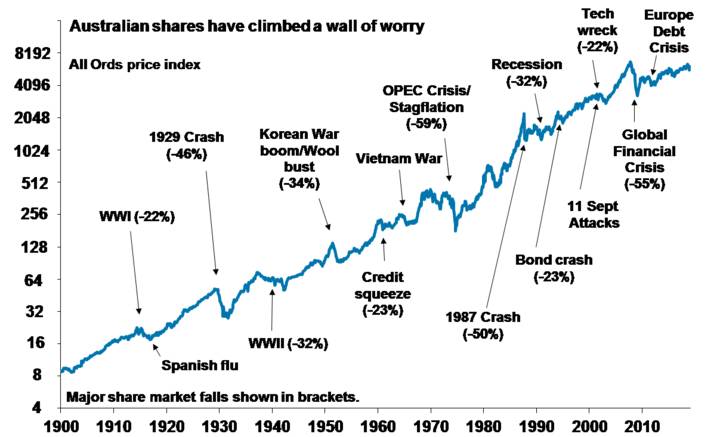
Source: ASX, AMP Capital
Key message: worries are normal around the economy and investment markets but most of them are just noise. It all seems louder and more worrying now because it’s getting magnified by social media screaming for attention. Try to turn it down.
Chart #5 Time is on your side
In the short term, investment markets bounce all over the place. Even annual returns in the share market are highly volatile, but longer-term returns tend to be solid and relatively smooth as can be seen in the next chart. Since 1900, for Australian shares roughly two years out of ten have had negative returns but there are no negative returns over rolling 20-year periods. (It’s roughly three years out of ten for US shares since 1900.)
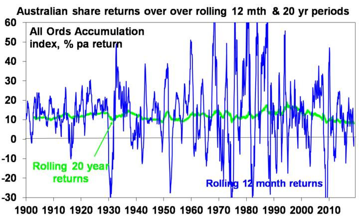
Source: Global Financial Data, AMP Capital
Key message: the longer the time horizon, the greater the chance your investments will meet their goals. So in investing, time is on your side and its best to invest for the long term.
Source: Shane Oliver, Head of Investment Strategy and Chief Economist – AMP Capital